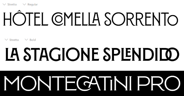
Montegatini Pro is a font created by Louise Fili in 2017, with heavy inspiration from early 1900s Stile Liberty travel posters from Italy. It’s a serif-type font, with very dramatic strokes in the letters; which is very prominent in the bottom terminal of the letter “S”, as well as the crossbar in one variation of the letter “A”. The font is also programmed to pair certain letters together in a legible manner, which is particularly clear with the pairings “CO”, “LA”, “LE”, and “DO”. There is subtle variation in letter thickness, which is most clear in the bottom terminals of the letters “C”, “S” and “R”, and the crossbar in the alternate letter “A”. The letter “O” seems to be geometrically perfect, therefore giving it a perfected centered horizontal axis. The font has bracketed serifs and strong vertical emphasis, which, when combined with the previously made observations, overall makes me believe it is most similar to a transitional typeface.
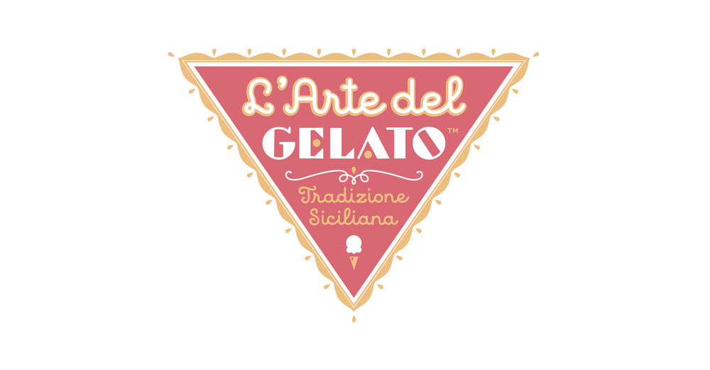
This logo for “L’Arte del Gelato” uses two different fonts for contrast, with the word “Gelato” notably being the only word in a different font from the rest of the composition. The juxtaposition allows for “Gelato” to be displayed as the primary information. “L’Arte del” being about the same size as the primary information makes it come off as secondary information, and “Tradizione Siciliana” is much smaller than the rest of the text in the logo, making it the tertiary information of the composition.
A majority of the font used is a sans serif, script-style font, with consistent thickness throughout the text. This makes it clear that it is a [blank] type font. The font used for the word “Gelato” is a sans serif font, with extreme variations in letter thickness; there’s also a very notable diagonal stress in the letter “O”, which makes it appear to be a [blank] type font.